

LAUNCHING
THE NEXT
GENERATION


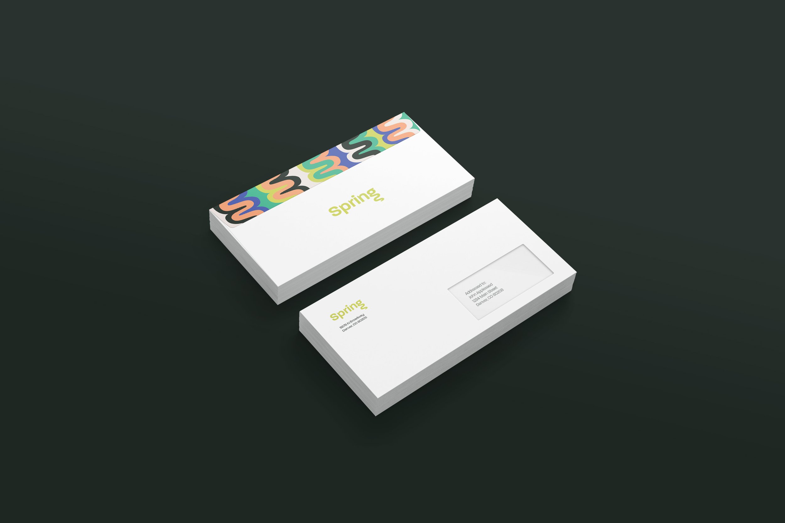
PRIMARY LOGO
I designed the Spring logo by taking the name itself and incorporating a spring shape into the loop of the letter g. The logo needs to stand the test of time and represent a brand that can represent career professionals, and is thus clean-cut and simple, while also incorporating the energetic, funky nature of Gen Z.


COLOR PALETTE


Spring’s palette was chosen with Gen Z and its style in mind; it uses bright, contrasting colors that evoke feelings of energy and creativity.

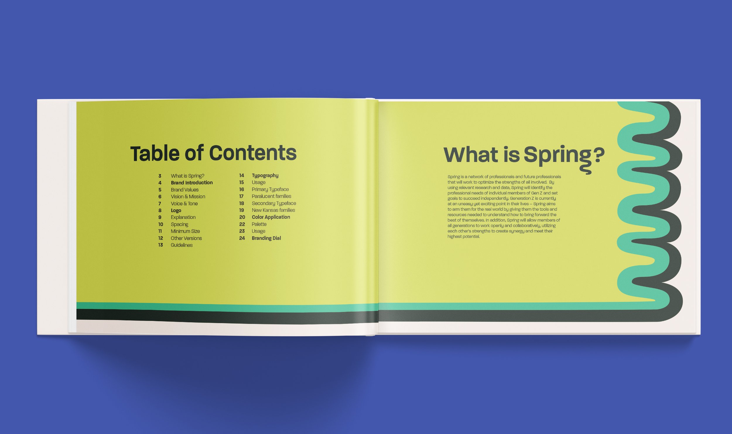
TYPOGRAPHY

PRIMARY TYPEFACE
Chosen to reflect the quirky and authentic nature of Gen Z, Paralucent is to be used in all bodies of text, including headlines, subheads, and in body copy. Body text must be easily readable to both Gen Z and their parent audiences.
LOGO & HEADLINES: DEMI BOLD

ACCENT TEXT: MEDIUM

BODY TEXT: LIGHT


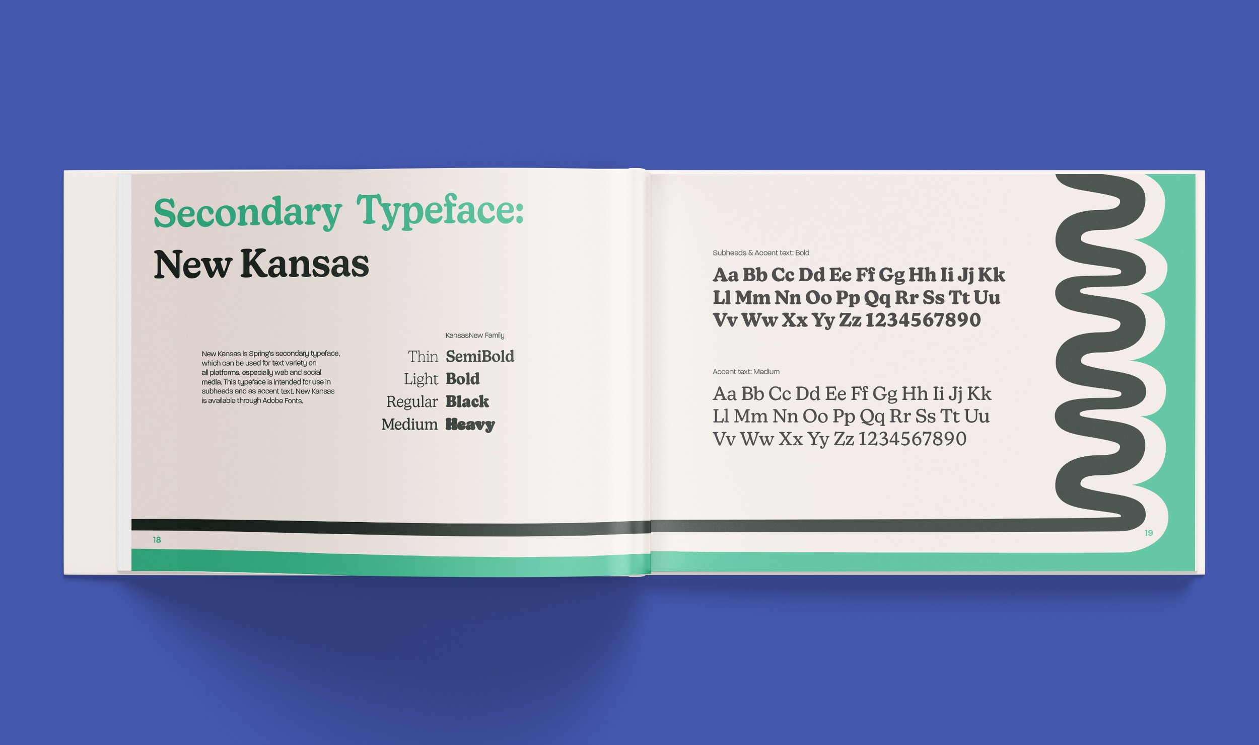
SECONDARY TYPEFACE
New Kansas is to be used as a font pairing for text variety on all platforms, especially web and social media. This typeface is intended for use in subheads and as accent text.
SUBHEADS & ACCENT TEXT: BOLD

ACCENT TEXT: MEDIUM


BRAND GUIDE


BRAND APPLICATION

DIGITAL BRAND USAGE


CREDITS
Abby Ostdiek
Brand Strategist / Audience Strategy
Payton Pfanstiel
Copywriter / Editing